In the recent few years, rapid advancements in BIG data technologies have been associated with complementary advancements in data visualization techniques. Several eminent speakers at the recent data science congress summit 2017 in Mumbai, India, spoke about the power of data visualizations and their applications in the field of data science.
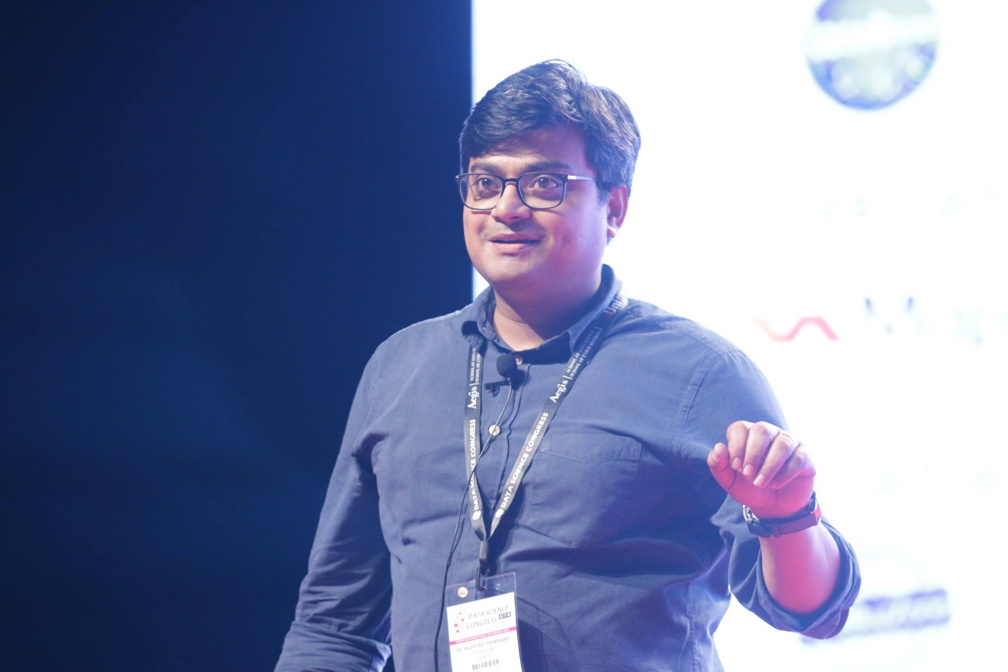
Dr. Soudip Roy Chowdhury, Chief Data Scientist of Cuddle.ai talked on how visualizations makes communications simple and intuitive. He said that good data communication is about communicating only relevant information to the users in a very personalized, intuitive, interactive and visual manner. Information that is communicated should be accurate and comprehensive enough to let users take actions. He also emphasized on the need to communicate in a timely manner, in order to ensure that the information is still relevant, contextual and gives instant gratification to the end user.
Data visualization tools like Tableau and Qlik Sense have made it very easy to build complex data visualizations. Mr. Cyrus Lentin, Founding Team Member of IndusGuru Network Partners, took a day long seminar on Qlik Sense during the data science congress event, to help the audience to quickly get started with building cool and interactive data visualizations.
Deepak Ghodke, Country Manager for Tableau India, was on one of the discussion panels of data science congress. He said that if data is presented visually, it increases the human ability to interpret it, and we can quickly find hidden patterns within data, that may have otherwise gone unnoticed. He said that good data visualizations help in bringing out the analyst within us, and we can instantly start having a conversation with the data.
One of the most interesting presentations during the three day event was that of Mr. S. Anand, CEO & Chief Data Scientist at Gramener. He showed a live demonstration of interactive visualizations and explained how they help in getting better insights. He said that interactive visualizations help in engaging users and building trust on analytical models, thereby increasing the chances of users adopting them. A key aspect of the presentations of Mr S. Anand was the fact that all his interactive visualizations were presented on the web, which truly helps in democratizing data within organizations. With the slick software interfaces and visualizations, Gramener is greatly appreciated as an innovative and fast growing startup company within less than 3 years into its existence.